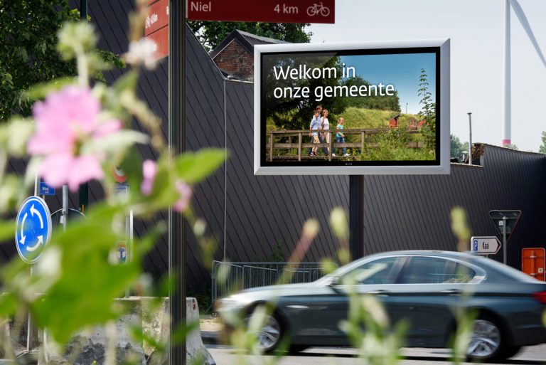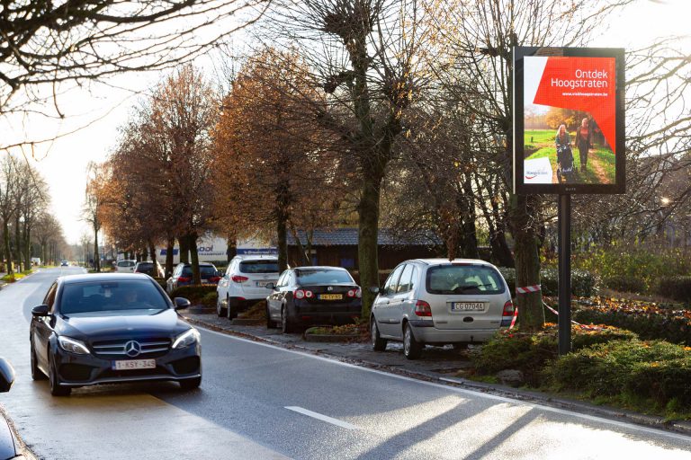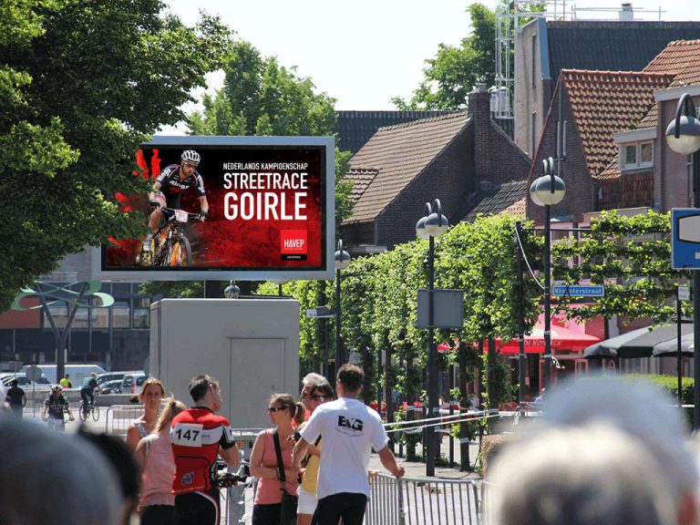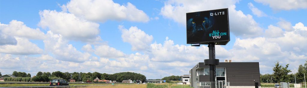
An LED screen with your message in the center of the city, along an approach road or highway. Creating the message is easy, but how do I make this content attractive and clear? The basis for good content is short, concise and a simple message. Below are 6 tips to make your message even more attractive.
Tip 1: Simplicity is the key
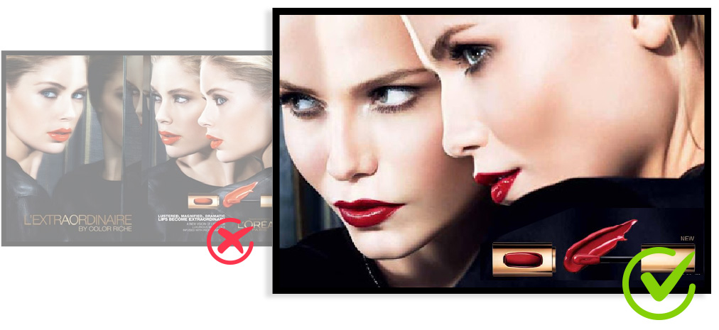
You often pass LED screens in a car or on a bicycle. So the viewing time is short. It is important that the message is clear quickly, so use few details. Due to the use of few details, the message is better absorbed when driving past. If you use an image, make sure you make a good crop of the highlighted part. This immediately draws attention to the right point.
Tip 2: The right font
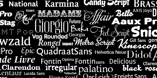
Choosing the right font is a must. Make your message clearer by using the right font. Therefore, go for a “serif font”, this font has a simple design with a thick border. These specifications make the message clearer. Think of Arial, Helvetica, Tahoma and Verdana. Use the same font and alternate between upper and lower case. Leave out effects such as shadows, as this makes the message less attractive.
Tip 3: The bigger, the better
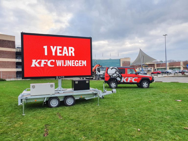
This isn’t always the case, of course, but it is now. Small letters are less legible. The viewing time of passing traffic is often only 6 to 10 seconds, which means that the message does not come into its own. Therefore, make the letters LARGE. But what is big? When choosing the size, the reading distance must be taken into account. You can use this handy rule to determine this. Divide the reading distance by 5. If the target group is 100 meters away, choose a font size of at least 20 cm high. This formula assumes good conditions (such as lighting and reading angle, etc.) and that the reader is stationary.
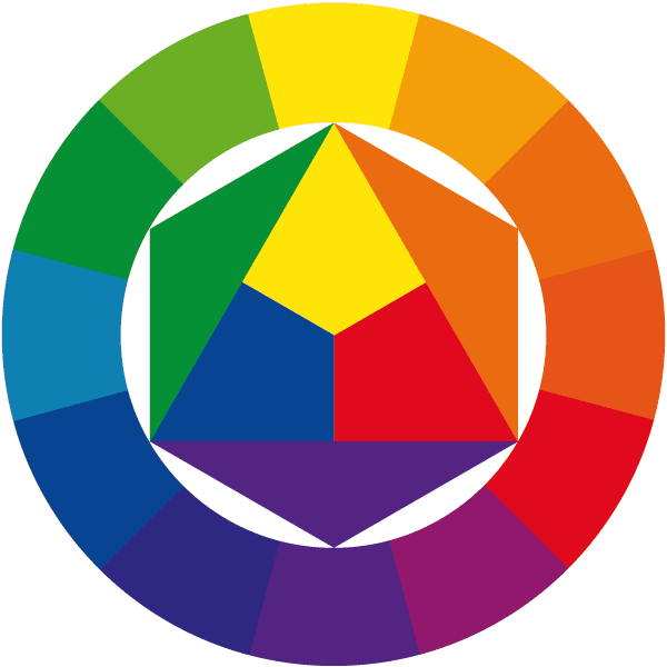
Tip 4: Contrast is important
Contrast ensures optimal readability of the message. The more the foreground and background stand out from each other, the better. A handy tool to determine the best contrast is the color wheel. In the wheel, the opposite colors reinforce each other, creating a great contrast. Did you know that white letters on a black background are easier to read than black letters on a white background and this also saves energy? Win-Win!
Tip 5: From left to right
Humans naturally look from left to right and then from top to bottom. The first thing you notice about the message is at the top left. Therefore, place the most important part of the message at the top left. This makes the message more noticeable.

Tip 6: Help from an unexpected quarter
From the car or walking in the city you often tend to look into the eyes of animals or people. If you start paying attention you will see that this happens naturally. This is an unconscious process from the brain. Why not use this process to make the message stand out? When designing the message, use animals or people that look you in the eye. As a result, more people are reached without them realizing it.
Let's summarize:
To make the message as impactful as possible, keep it short and concise! Adjust the content according to the size of the LED screen to make the message clearer. Remember, the bigger the letters the better and contrast is key. In this way, all eyes are on your message. .
Have fun creating attractive content for your LED screen! Still need help, make an appointment via our website. We are happy to help you!